
Forged on Nebraska Gravel: The Story Behind Our New Gravel Worlds Icon
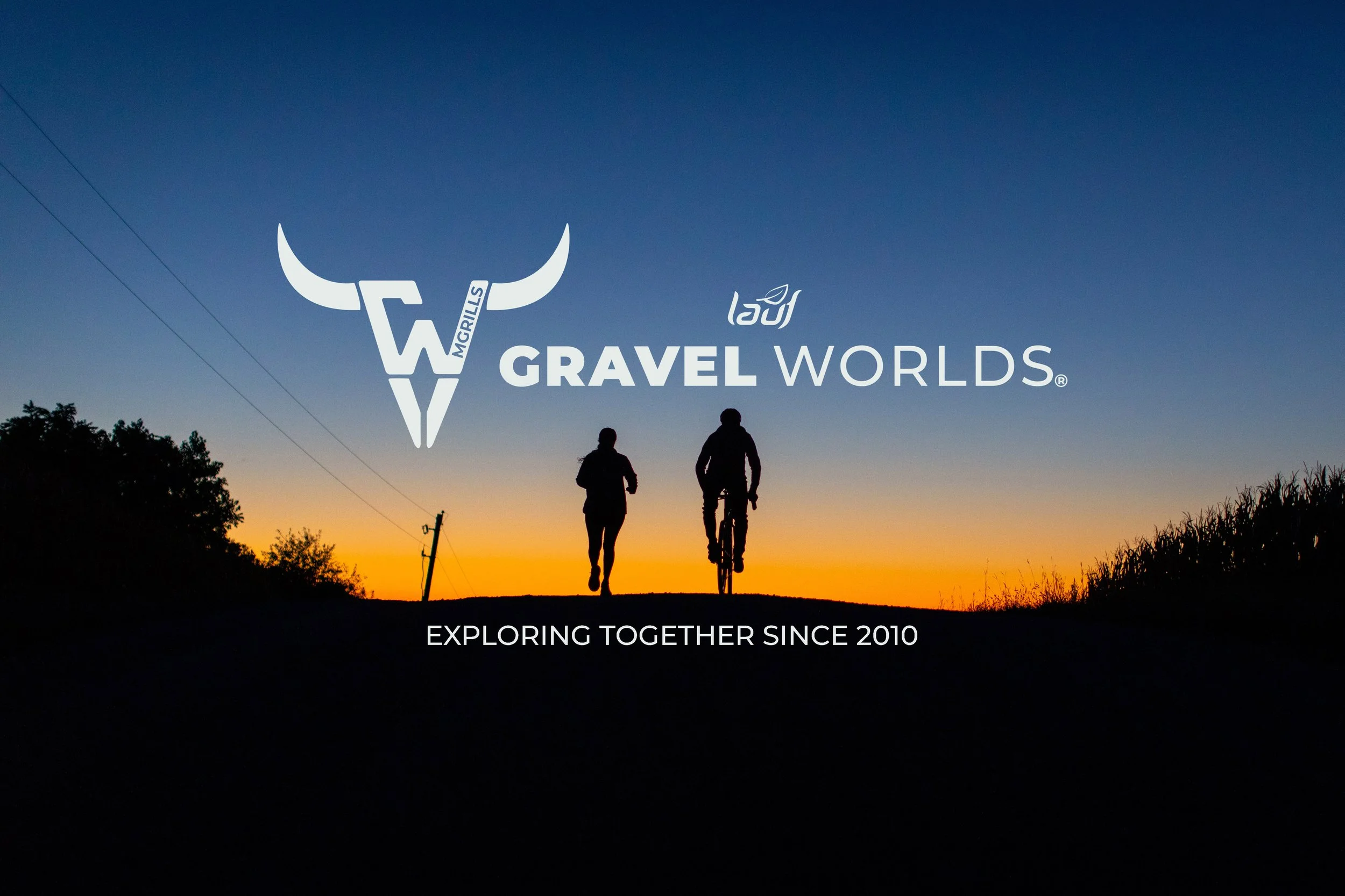
Every great event has a symbol that instantly brings people back to the experience. As Gravel Worlds has continued to evolve, we knew the time had come to create an icon that could stand proudly on its own while remaining unmistakably part of the Gravel Worlds family. We wanted something that could live on hats, jerseys, signs, trophies, and social media graphics, a mark that riders would immediately recognize and connect with. To help us bring that vision to life, we partnered with Armor Marketing.
Our first meeting was all about discovery. We shared what Gravel Worlds means to us and to the community that has grown around it over the years. We wanted the icon to feel approachable and welcoming while also reflecting the rugged beauty of Nebraska and the roads we travel together each August. It was important that the mark represent not only the event itself, but also the landscape, culture, and spirit of the place we call home. We discussed practical needs as well: the icon needed to work both alongside our existing wordmark and as a standalone symbol. We provided Armor Marketing with our brand colors, typography, and other visual elements so they could build something that felt authentically Gravel Worlds from day one.
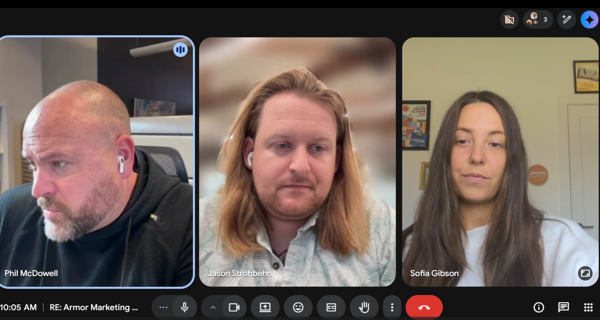
When we gathered for our second meeting, Armor Marketing returned with a series of early concepts. Seeing our ideas translated into sketches and rough designs was an exciting moment. Several concepts immediately resonated with us, and we found ourselves especially drawn to three. One theme in particular kept rising to the top: the idea of a “brand,” reminiscent of the mark featured on our 1,500 Mile Club trophy. It felt timeless, distinctly Western, and perfectly at home on the Nebraska gravel roads we love. With that direction in mind, we gave the team our enthusiastic support to continue refining and building upon those concepts.
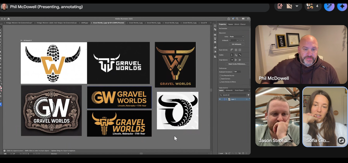
By our third meeting, those initial ideas had evolved significantly. Armor Marketing presented more polished versions of the concepts, allowing us to evaluate the finer details of each direction. We discussed proportions, symbolism, and how each icon would function across merchandise, signage, digital media, and race assets.
This meeting was all about narrowing our focus. Through collaborative discussion, we eliminated ideas, combined elements we loved, and identified the strongest direction moving forward. By the end of the meeting, we had confidently narrowed the field and were ready to see final refinements.
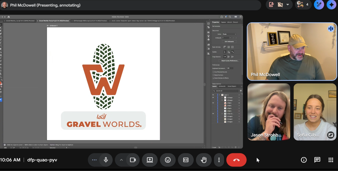
Our fourth and final meeting brought everything together. Armor Marketing presented the two finalist designs, each representing months of collaboration and thoughtful iteration.
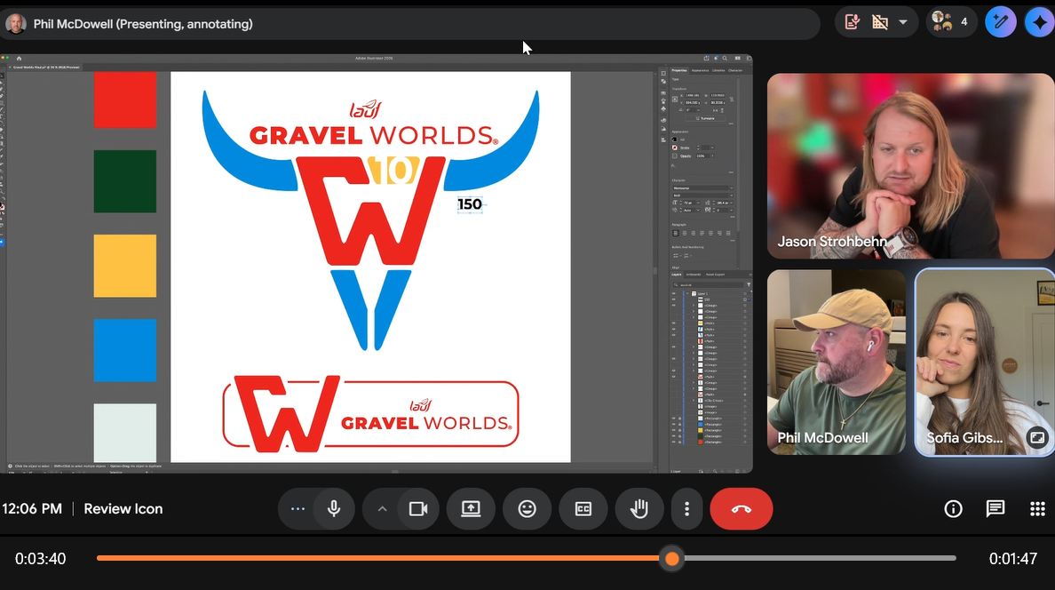
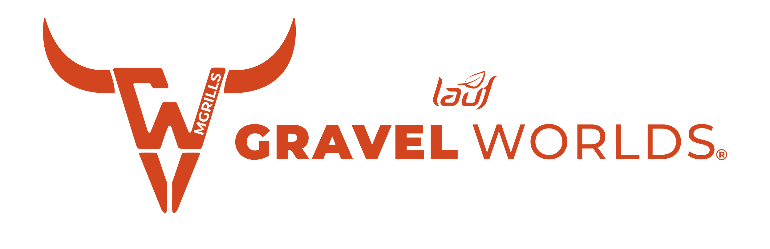
The final icon tells a story that is uniquely ours. At its center is the bull, a symbol that pays tribute to Nebraska's proud cattle heritage while also recognizing the roots of our parent company, GoodLife Brands, whose story began in the beef industry. At the base of the icon, you'll find the "GW," representing Gravel Worlds, with the ability to incorporate the presenting sponsor of each distance into the design.
The result is more than just a logo. It's a symbol of where we ride, where we come from, and the community that continues to make Gravel Worlds unlike any other event.
Working with Armor Marketing throughout this process was a true collaboration. They didn't simply create a logo, they immersed themselves in our story. They listened to our ideas, challenged us creatively, and transformed countless conversations into a mark that feels authentic to Gravel Worlds.
Branding isn't something that happens overnight, and this process is proof of that. Every meeting built on the last, every revision had purpose, and every decision brought us closer to an icon that will represent Gravel Worlds for years to come. We're incredibly proud of what we created together and grateful to Armor Marketing for helping us tell our story in a way that is simple, recognizable, and unmistakably Nebraska.